[Previous] [Contents] [Index] [Next]

Tutorials

The best way to get to know PhAB is to use it. This chapter provides hands-on sessions to give you a jump start on creating applications:

We'll take a closer look at using PhAB in the chapters that follow.

The first two tutorials cover the basics: creating widgets, changing how widgets look and behave, generating code, running your application, and so on.

The remaining tutorials go beyond the basics to show you how to create working menus, dialogs, and windows. When you've completed these tutorials, you'll be ready to start building almost any Photon application.

Before you start...

You can start PhAB from the Launch menu in the lower left corner of the screen; choose the Development submenu, and then choose Builder.

You can also start it from a pterm window by typing:

appbuilder

For information about command-line options, see appbuilder in the QNX Utilities Reference.

Before you start the tutorials, take a moment to make yourself familiar with PhAB's user interface:


phab at a glance


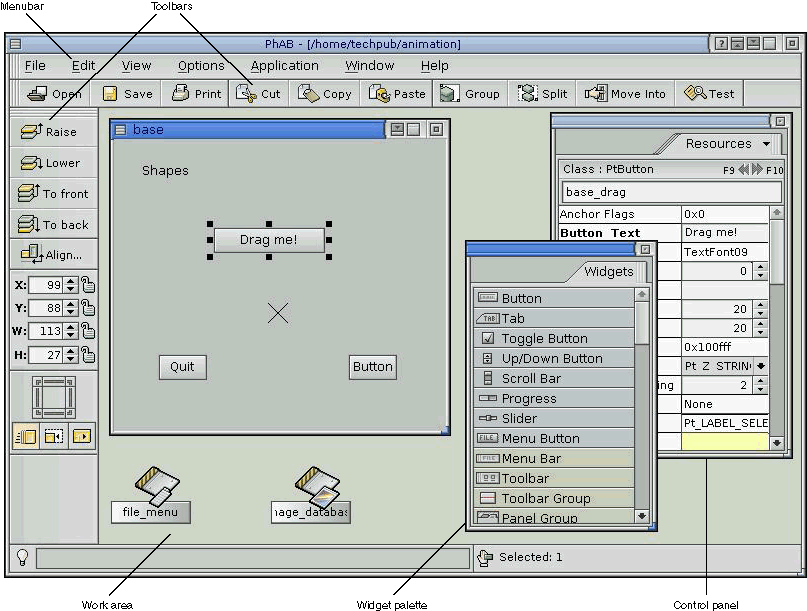
Overview of PhAB's user interface.


Menubar
Import graphics, create windows and dialogs, generate C and/or C++ code to implement your entire user interface, and more.
Toolbars
Save time with the toolbars -- with a couple of mouse clicks you can duplicate, move, align, group or resize any number of widgets.
Work area
Provides a flexible area where you can work on several application modules all at once.
Widget palette
Makes it easy to add widgets to your application. Just click on the widget you want, then click where you want it.
Control panels
Let you fully customize your application's widgets. You can choose text fonts, modify colors, customize bitmaps, and attach callbacks that will pop up dialogs or invoke C and/or C++ code you've supplied.

The widget palette and control panels are initially in the same window, but you can drag any of them into a different window. To switch between panels in a window, click on the tab at the top and choose a panel from the menu.

If you close a control panel, you can redisplay it by selecting the appropriate item from the View menu.

Tutorial 1 -- Hello, world

In this tutorial you learn how to use PhAB to create and compile a simple application.

Creating the application

  1. From the File menu, choose New to create a new application. PhAB displays a dialog to let you choose the style for the new application's default base window:

    Choosing the style of the base window

  2. Choose a style and click Done; PhAB creates the base window and displays it.
  3. Whenever you create a new application, it's a good idea to save the application and give it a name.

    From the File menu, choose Save As to open the Application Selector dialog. Click on the Application Name field, type tut1, then press Enter or click on Save Application.

  4. Look at PhAB's titlebar. It now indicates that the current application is named tut1.
  5. If the widget palette isn't displayed, click on the tab at the top of the current control panel and choose Widgets from the menu that appears.
  6. Drag the widget palette away from the other control panels by pointing to the left of its tab, holding down the mouse button, and pointing to PhAB's work area.
  7. If you wish, resize the widget palette and control panels.
  8. Go to the widget palette and click on the PtLabel widget icon:

    PtLabel icon

  9. Move the pointer into the application's base window (the pointer changes to a crosshair) and click anywhere near the center of the window.

    PhAB automatically does the following:

  10. Go to the Resources control panel and highlight the text Label beside the "Label Text" resource.
  11. Change the text to Hello World. As you type, the text in the widget changes:

    Hello World widget

Generating code

Now you're ready to generate, compile, and execute the application.

  1. From the Application menu, choose Build + Run. PhAB automatically saves your application, and then displays the Build + Run dialog.
  2. Click on Generate. You'll see a dialog for selecting a platform, a combination of the operating system, computer, and compiler to use. Choose the appropriate one. For example, if you're using the QNX OS on an Intel x86 machine and the gcc compiler, choose ntox86 and gcc.
  3. Click on the Generate button to start the code generation process. You'll see a progress dialog:

    Generate Progress dialog

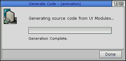
    Wait for the generation process to complete, then click on Done to close the dialog.

  4. Click on Make to compile the code. You'll see the Make Application dialog, which displays the files as they're compiled.
  5. Once the application has been compiled and linked, PhAB will enable the dialog's Done button. Click on Done to close the dialog.
  6. Click on Run to execute your new application. The application will appear in its own window, with the text "Hello World" in the center and the default title "My Application" in the title bar:

    Hello World application

    Congratulations! You've just created your first Photon application using PhAB.

  7. To quit the application, click on the window menu button in its top-left corner, then choose the Close item.
  8. Click on Done to close the Build + Run dialog.

Want more info?

For more info on compiling, running, and debugging an application, see the Generating, Compiling, and Running Code chapter.

Tutorial 2 -- editing resources

This tutorial introduces you to PhAB's resource editors, which let you change how widgets look and behave. You'll find out how to edit virtually any kind of resource a widget may have, including:

You'll also learn how to create a template so you can create other instances of an existing widget.

Adding a button widget

  1. From the File menu, choose New to create a new application. Choose the Plain window style. Save your application as tut2.
  2. Click on PtButton in the widget palette:

    PtButton icon

  3. Click near the center of the application's window. You'll see a button widget.
  4. Drag any of the button's resize handles until the button matches the following picture:

    button in window

Changing the bevel width

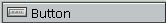
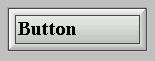
Let's now edit a numerical resource -- the button's bevel width.

  1. Click on the "Bevel Width" resource in the Control Panel. You'll see the number editor:

    Number editor

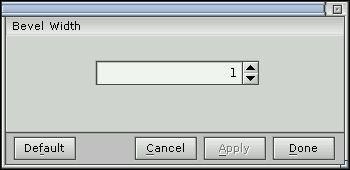
    This editor lets you change the value of any numerical widget resource.

  2. Change the value to 6. To do this, you can:
  3. To apply the new value and close the editor, press Enter or click on Done.

Note: You can also edit this resource (and most resources) right in the Resources control panel. Choose whichever method you like.

Changing the font

Let's change the font of the button's text:

  1. Click on the "Font" resource. You'll see the font editor, which displays the button's current font:

    Font editor

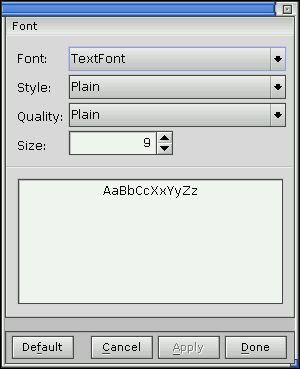
    This editor lets you change the text font of any widget that has text.

  2. Click on the Font box or the Size box, select a typeface or size from the displayed list, and click on Apply. The button displays the new font.
  3. Click on Default. The editor displays the widget's default font, but doesn't apply the font to the widget.
  4. If you want to keep the new font that you selected, click on Cancel to ignore the default. If you want to apply the default, click on Done. Either way, the editor closes.

Changing the text alignment

Now let's change the button's horizontal text alignment:

  1. Scroll through the Resources control panel to find the "Horz Alignment" resource, then click on it. You'll see the flag/option editor, which displays the widget's current text alignment:

    Flag/option editor

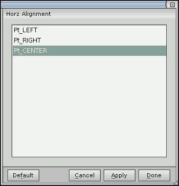
    This editor serves a dual purpose in PhAB:

  2. Click on Pt_LEFT or Pt_RIGHT, then click on Apply. You'll see the button text move to the left or right edge of the button.
  3. Click on Done.

You can also set this resource right in the Resources control panel.

Setting flags

Let's now use the flag/option editor to set one of the widget's flags:

  1. Scroll through the Resources control panel to find the "Basic Flags" resource, then click on it. The flag/option editor reopens, but this time it shows the widget's current PtBasic flag settings:

    Flag/option editor

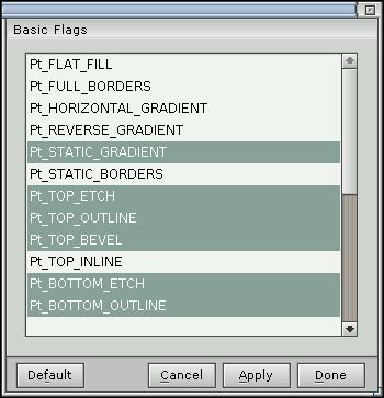
    The bits in a flag resource aren't mutually exclusive, so this time you can use the editor to select multiple options, if desired.

  2. Set the Pt_TOP_INLINE, Pt_BOTTOM_INLINE, Pt_LEFT_INLINE, and Pt_RIGHT_INLINE flags, then click on Done. PhAB draws the button with an inner border:

    Button with inner border

Changing the fill color

Let's change a color resource -- the button's fill color.

  1. Click on the button's "Color: Fill" resource. You'll see the color editor, which displays the current fill color:

    Color editor

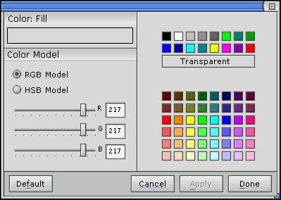
    This editor lets you edit any color resource. It provides several preset base colors, which should work well with all graphic drivers, and 48 customizable colors for drivers that support 256 or more colors.

  2. Click on any color in the Base Colors set, then click on Apply. The button is filled with the color you selected.
  3. Select a color from the Custom Colors set. The sliders will display the color's Red/Green/Blue (RGB) values. Change these values till you get a color you want, then apply your changes.

    If you'd like to experiment with the Hue/Saturation/Brightness (HSB) color model, click on the HSB Model button.

  4. Click on Done when you've finished experimenting with the editor.

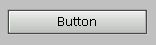
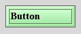
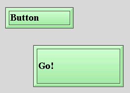
Your button should now look something like this:

Big green button

Don't delete this widget; we'll use it to create a template later on, so that you can create other widgets like it.

Editing a pixmap

Let's now use the pixmap editor to edit a PtLabel widget. This editor is called "pixmap" instead of "bitmap" since it lets you edit many types of image resources besides bitmaps.

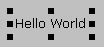
A PtLabel widget display text and/or an image.

  1. Click on PtLabel in the widget palette:

    PtLabel icon

  2. Move the pointer into the main window and click below the button widget you created. You'll see a PtLabel widget.
  3. Click on the Label Type resource in the Resources control panel, and set it to Pt_IMAGE.
  4. Click on the Label Image resource in the Resources control panel to bring up the pixmap editor.
  5. Next, bring up the color editor to select a draw color. Just click on the following button:

    Color Fill button

  6. Select a color from the pixmap palette. You'll see that the draw color in the pixmap editor changes immediately.

    If you click on Edit Color, you'll see the Color Editor, as described earlier.

  7. To draw a simple image, you can:

    Feel free to try the other drawing tools.

  8. When you're done, click on the pixmap editor's Done button to apply your changes and close the editor.

Editing multiline text

Next, we'll edit a multiline text resource -- the text of a PtMultiText widget.
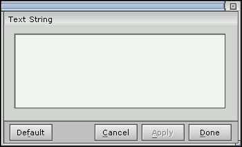
  1. Click on PtMultiText in the widget palette:

    PtMultiText icon

  2. Move the pointer below the label widget you've just created, and drag until the new PtMultiText widget appears big enough to hold a few lines of text.
  3. Click on the "Text String" resource in the Resources control panel to bring up the multiline text editor:

    Multiline text editor

  4. Type a few lines of text. To create a new line, press Enter. For example:

    Mary hadEnter
    aEnter
    little lamb.Enter

  5. Click on Done. Your text should appear exactly as you typed it. If it doesn't, try resizing the widget -- the widget might not be wide enough or tall enough.
  6. For a different effect, look for the "Horz Alignment" resource, click on the arrow, and change the text alignment to Pt_CENTER. As you can see, each line is now centered individually.
  7. If you haven't already, resize the widget by dragging on one of its resize handles. You'll see the text update automatically to adjust to the new size. For example:

    Multiline text example


Note: You can edit the text right in the control panel, but it displays only the current line of text.

Editing a list of text items

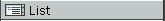
Let's now create a PtList widget and add text to the widget using the list editor. This editor lets you add and edit text for any widget that provides a list of text items.

  1. Click on PtList in the widget palette:

    PtList icon

  2. Move the pointer into the application's base window, and drag the pointer until the new PtList widget appears big enough to hold a few lines of text.
  3. Click on the "List of Items" resource to bring up the list editor:

    List editor

  4. Click on the text box at the bottom of the editor. You'll see the text-input cursor.
  5. Type some text, then click on Add After to place the first item in the list.
  6. Now let's create the second item. Click in the text box, and type Ctrl -U to erase the text in the text box, then type some new text.

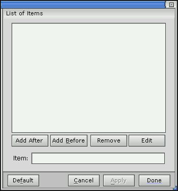
    Click on Add After to place this new item after the previous item.

  7. Repeat the above step as often as you'd like.
  8. Click on Apply. The PtList widget should now display the list you've created.
  9. Now try editing the list:
  10. When you're finished experimenting, click on Done to apply your changes and close the editor.

Creating a template

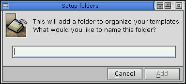
At times, you might want to create many widgets that look and behave alike. You can do this by creating a widget, editing its resources, and then copying and pasting it, but this isn't always very convenient.

PhAB makes it simpler by letting you create a template from an existing widget or widgets. PhAB creates a palette, similar to the widget palette, for your templates.

Let's create a template from the button that you created earlier in this tutorial.

  1. Start by selecting the button.
  2. Click on the Edit menu, and then choose Save as template. The Save template dialog appears.

    Save template dialog

  3. You need to create a folder in which to store the template, so click on Add Folder. This dialog is displayed:

    Add Folder dialog

  4. Type My_templates as the folder's name, and click Add. The dialog closes, and the folder's name is displayed in the Save template dialog.
  5. Give the template a name, such as Big green button. This is the name that PhAB uses in the palette.
  6. You must create an icon for the palette entry for the template. Click the Edit Icon, and then follow the instructions given earlier for editing pixmaps. You should make the icon look something like the widget:

    Green button icon


    Note: 
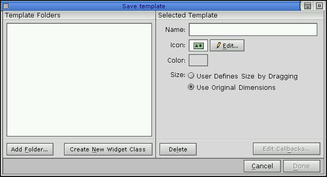
The Save template dialog doesn't display the icon that you create for the template.
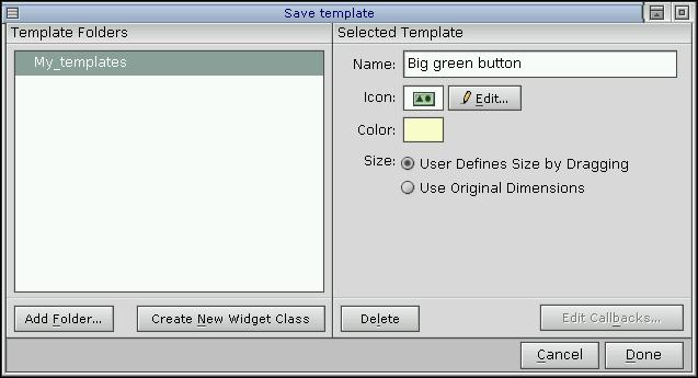
  7. Optionally, choose the background color for the palette entry by clicking on the Color box. You can use different background colors in a palette to distinguish widgets that are used for different purposes (e.g. buttons and text widgets).
  8. Choose a resize method. This determines whether you drag or just click when you create instances of your template. For this button, choose the dragging method.
  9. The dialog should now look something like this:

    My template

    Click on Done.

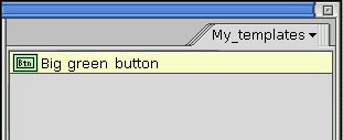
You've just created a template! Now, let's see how to use it.

  1. Click on the View menu. At the bottom of the menu is a list of palettes, which includes Widgets and My_template.
  2. Click anywhere outside the menu to close it.
  3. Go to the control panels, and click on the top tab. The popup menu now include My_templates; choose it to display the palette.

    Palette for My_template

  4. Click on the icon for your customized button, create an instance of it, and edit it as you wish:

    Template and instance

If you wish, you can save, generate, make, and run the application.

Whenever you start PhAB, it automatically loads the palette for My_templates.

Want more info?

You now know the basics of editing any widget resource in PhAB. For more information, see the following sections in the Editing Resources and Callbacks in PhAB chapter:

To edit: See this section:
Bitmaps or images Pixmap editor
Colors Color editor
Flags Flag/option editor
Fonts Font editor
Lists of text items List editor
Numbers Number editor or Flag/option editor
Single-line or multiline text strings Text editors

For more information on templates, see "Templates" in the Creating Widgets in PhAB chapter.

Tutorial 3 -- creating menus and menubars

This tutorial takes you through the steps required to create menus and menubars.

About link callbacks

In this tutorial, you'll learn how to set up a link callback, one of the key components of PhAB. To understand what a link callback is, let's start with some background info on widget callbacks.

Almost all widgets support a variety of callbacks. These callbacks enable your application's interface to interact with your application code. For example, let's say you want your application to perform an action when the user clicks on a button. In that case, you would attach a callback function to the button's "Activate" callback.

In some windowing environments, you can attach only code functions to widget callbacks. But whenever you use PhAB to create a callback, you can go one step further and attach entire windows, dialogs, menus, and much more. It's this extended functionality that we call a link callback.

PhAB provides two basic types of link callbacks:

Module-type link callback
Attaches an application module (such as a window, dialog, or menu) to any widget callback. The module opens whenever the callback's conditions are met. In this tutorial, you'll link a menu module to a button's "Arm" callback.
Code-type link callback
Attaches a code function to any widget callback. The widget invokes the function whenever the callback's conditions are met. Note that some code-type link callbacks let you close the parent module automatically. In this tutorial, you'll link a code function to a menu item's callback.

About instance names

To access a widget from your application code, you must first give the widget an instance name. Since all widget instance names reside in the same global namespace, no two widgets within an application can have the same instance name.

We recommend that you start every instance name with a module prefix. For example, if your base window has a PtButton widget that contains the label text "Blue," you could give this widget an instance name of base_blue.


Note: Adopting a naming convention for your widgets will make it easier for you to work with large applications.

Creating a menubar

To learn about using link callbacks, let's create two functioning menus -- File and Help -- that you can later incorporate into your own applications.

In PhAB, menus are built in two pieces:

Using link callbacks, you'll link the menu modules to the File and Help buttons in a menubar. You'll also link a code-type callback to the Quit menu item in the File menu module. This callback will enable the Quit item to close the application.

  1. From PhAB's File menu, choose New to start a new application. Choose the Plain window style.
  2. Save the application as tut3. (For information on saving your application, see the previous tutorials or "Saving an application" in the Working with Applications chapter.)
  3. Select the PtMenuBar widget from the widget palette, point at the top left cornet of the main window's canvas, and drag until the menu bar is the width of the window.

    The menubar grows and shrinks as you change the width of the window, and it always stays at the top of the window. You can see this by clicking in the titlebar of the window, then resizing the window by dragging on one of its resize handles.


    Note: If you accidentally click on the Test button at the right side of the module's title bar, the window won't resize or accept new widgets. If this happens, just click again on the same Test button or the Test button in PhAB's toolbar, or choose Un-test from the module's Work menu.

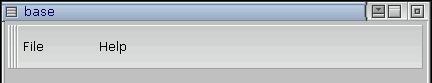
    By the time you're finished the following steps, the menubar will look like this:

    Finished menubar

  4. Place a PtMenuButton widget in the menubar you just created. The menu button is automatically centered vertically in the menubar.
  5. Go to the Resources control panel and click on the widget instance name just below the class name. Change the button's instance name to base_file:

    Instance name

  6. Change the button's Label Text resource to File.
  7. Place another PtMenuButton widget next to the first. Change its instance name to base_help and its text to Help.

Creating the File menu module

Now that you have menu buttons, you need to create your menu modules. Let's start with the File menu.

  1. From the Application menu, choose Menus to open the module selector. This selector lets you create or view any type of PhAB module.
  2. In the Name text box, type filemenu, then press Enter. Since this menu module doesn't exist yet, PhAB asks you if it should create the module. Click on Yes.

    You'll see the menu module appear in your work area and the module's name in the module selector's scrolling list.

  3. The module selector stays onscreen, allowing you to create more modules. However, you need to create only one menu right now, so click on Done to close the selector.

Adding menu items

Let's now add some menu items to the File menu.


Note: If you click on another module, the menu module becomes deselected, which means you can't work on it. To reselect the menu module, click on its titlebar.

  1. Click on the Menu Items resource in the Resources control panel. You'll see the menu editor:

    Menu Items editor

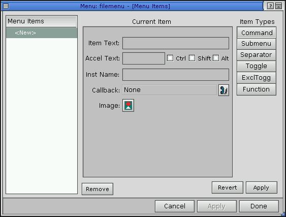
    If you look at the Menu Items list, you'll see that the <New> item is selected. This special item lets you add menu items to the menu.

  2. To add your first menu item -- which also happens to be called "New" -- click on the Item Text field, then type New.
  3. Now give the item an instance name. In the Inst Name field, type file_new.
  4. Click on Apply to add the item to the menu. You'll see the item's name in Menu Items list, prefixed by CMD. The CMD means this is a Command item; that is, an item that invokes a PhAB callback.
  5. Repeat the above steps to create the two menu items labeled "Save" and "Save As." Give these items the instance names file_save and file_as.
  6. Up to now, you've added Command-type menu items. You'll now add a Separator item. Just click on the Separator button near the upper-right corner. You'll see a list of separator styles:

    Menu separators

  7. Choose a style or just click on Apply to get the default separator style, which is Etched - In.
  8. Now let's add the Quit item. Click on the Command button, then specify Quit as the item text and file_quit as the instance name.
  9. You're finished with this menu module for now, so click on Done. The module displays the items you just created:

    Menu module

  10. You'll want to keep this module neatly out of the way while you work on your next task. So click on the module's minimize button (the left button at the right side of the title bar), or select the Work menu button (upper-left corner) and choose Minimize.

Creating the Help menu module

Using what you just learned about creating a menu module, do the following:

  1. Create your Help menu module and give it a name of helpmenu.
  2. In this module, place a single command item called About Demo and give the item an instance name of help_about. When you're finished, minimize the module.

Note: If one of your menu modules seems to "disappear" (you may have accidentally closed it or placed it behind another module), it's easy to bring the module back into view. See the " Finding lost modules and icons" in the Working with Modules chapter.

Attaching link callbacks

Let's return to the menu buttons you created earlier and attach link callbacks so that the buttons can pop up your menu modules.

Attaching a module-type link callback

  1. Select the File menu button, then switch to the Callbacks control panel You'll see the File button's callback list:

    Callback list

  2. To have the File menu module pop up when you press the File button, you need to attach an Arm callback to the button. By attaching an Arm callback, you can open the menu using either click-move-click or press-drag-release.

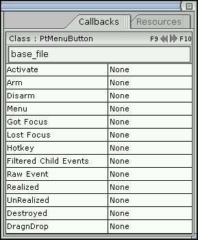
    Click on Arm to bring up the callback editor.

  3. The Module Types area of the editor let you choose the type of module you wish to link to. Because you want to link the File button to a menu module, click on Menu.
  4. Click on the Name field and type filemenu, which is the name you gave your File menu module. This links the menu button to that module.

    You can also select filemenu from a popup list of available modules. To bring up the list, click on the icon to the right of the Name field.

  5. Click on Apply to add the link callback, then click on Done to close the callback editor.
  6. Repeat the above steps to link the Help menu button to the Help menu module.

Attaching a code-type link callback

Let's now attach a code-type link callback to the File menu's Quit item so that it can terminate the application.

  1. Double-click on the iconified filemenu module. This opens and selects the module.
  2. Switch to the Resources control panel, then click on the Menu Items resource.
  3. Select the Quit item in the Menu Items list.
  4. Click on the icon next to the Callback field to open the callback editor:

    Callback icon

  5. When the editor opens, the default callback type is Code. Since this is the type you want, all you have to do is specify the name of the function you want to call.

    The function should have a meaningful name. So type quit in the Function field.

  6. Click on Apply to update the Callbacks list, then click on Done to close the editor.
  7. Click on Done again to close the menu editor.

Setting up the code

You'll now generate the code for your application and edit a generated code stub so that the Quit item will cause your application to exit.

  1. From the Application menu, choose Build + Run and generate the application code.
  2. After the generation process is complete, the Build + Run dialog displays a list of generated files.

    Scroll through the list until you see the quit.c file. This is the generic code template that PhAB generated for your quit() function.

  3. You need to make the function exit the program. To do this, select quit.c from the file list, click on the Edit button, then change the quit() function to the following:
    int
    quit( PtWidget_t *widget, ApInfo_t *apinfo, 
          PtCallbackInfo_t *cbinfo ) 
    {
    
         /* eliminate 'unreferenced' warnings */
         widget = widget, 
         apinfo = apinfo, 
         cbinfo = cbinfo;
    
         PtExit( EXIT_SUCCESS );
    
         /* This statement won't be reached, but it
            will keep the compiler happy. */
    
         return( Pt_CONTINUE );
    }

    PtExit() is a function that cleans up the Photon environment and then exits the application. It's described in the Photon Library Reference.

  4. After you've edited the code, saved your changes, and closed the editor, click on Make to compile the code.
  5. Click on Run Application to run the application.
  6. Once your application is running, try clicking on the File button to bring up the File menu. Then choose Quit. Your application will immediately terminate and close.

Want more info?

For more info on: See the section: In the chapter:
Widget callbacks Callbacks Editing Resources and Callbacks in PhAB
Editing callbacks Editing Resources and Callbacks in PhAB
Instance names Instance names Creating Widgets in PhAB
Menu modules Menu modules Working with Modules

Tutorial 4 -- creating dialogs

This tutorial describes how to create a dialog. It also provides a good example of how you can use setup code to modify a widget's resources before the widget appears onscreen.


Note: This tutorial uses the application you created in Tutorial 3.

In this tutorial, you'll:

About dialogs

Dialog modules are designed to let you obtain additional information from the user. Typically, you use this information to carry out a particular command or task.

Since you don't usually need to get the same information twice, dialogs are single-instance modules. That is, you can't realize the same dialog more than once at the same time. If you try create a second instance of a dialog, PhAB simply brings the existing dialog to the front and gives it focus.

If you need to create a window that supports multiple instances, use a window module. You'll learn about window modules in the next tutorial.

More on instance names

To make it easier for you to access widgets from within your application code, PhAB generates a global variable and a manifest. Both of these are based on the widget's instance name.

The global variable, which has the prefix ABN_, represents the widget's name. The manifest, which has the prefix ABW_, represents the widget's instance pointer.

For example, let's say you have a widget named about_version. PhAB uses this name to generate a global variable named ABN_about_version and a manifest named ABW_about_version.

In this tutorial you'll learn how to use these generated names.


Note: The value of a widget's ABN_... variable is unique in the entire application.

Attaching a dialog module

  1. Open the tut3 application you created and use the File menu's Save As item to save the application as tut4.
  2. Open the Help menu module you created (it may still be iconified).
  3. Click on the Menu Items resource in the Resources control panel to open the menu editor.
  4. Select the "About Demo" item, then click on the icon next to the Callback field to open the callback editor:

    Callback icon

  5. When the editor opens, the default callback type is Code. Go to the Module Types group and change the callback type to Dialog.
  6. In the Name field, type aboutdlg as the name of the dialog module you want to link to. (This dialog doesn't exist yet, but PhAB will ask you later to create it.)
  7. In the Setup Function field, type aboutdlg_setup. This is the name we're giving to the setup function that will be called before the dialog is realized.

    Using this function, we'll change the content of a label widget within the dialog to display a version number.

  8. Since you want the aboutdlg_setup function to be called before the dialog is realized, make sure the Prerealize button is enabled.
  9. Click on the Location icon to specify where you want the dialog to appear when it gets realized. (The "Center Screen" location is a good choice.) Click on Done.

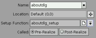
    Your callback information should now look something like this (depending on the location you chose):

    Callback information

  10. Click on the Apply in the Actions group to add the link callback. Since the dialog module you want to link to doesn't exist yet, PhAB asks you to choose a style; select Plain and click Done.

    You'll see the new dialog in the work area. You'll also see the new callback in the Callbacks list in the callback editor.

  11. Click on Done to close the callback editor, then click on Done again to close the menu editor.

Adding widgets to the dialog

  1. Open the aboutdlg dialog module.
  2. Place two PtLabel widgets in the top half of the dialog, and a PtButton near the bottom:

    Dialog with widgets

  3. Select the top PtLabel widget and change its label text resource to About this Demo. Then change its horizontal alignment to Pt_CENTER.
  4. Select the other PtLabel widget and change its label text to a blank string. Then change its horizontal alignment to Pt_CENTER.

    Later, you'll fill in the aboutdlg_setup() function so that it changes the blank text of this label to display a version number.

  5. You must give this blank PtLabel widget an instance name since you'll be referring to it in code. So change its instance name to about_version.
  6. Select the PtButton widget and change its button text resource to Done. Then change its instance name to about_done.
  7. Let's center the widgets horizontally in the dialog. Select both PtLabel widgets and the PtButton widget, choose Alignment from the Edit menu, and then choose Alignment Tool from the submenu. You'll see the Align Widgets dialog:

    Alignment dialog

  8. In the Horizontal column, click on Align Centers and on Align to Container. Then click on the Align button.

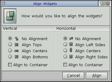
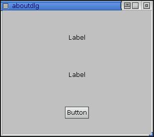
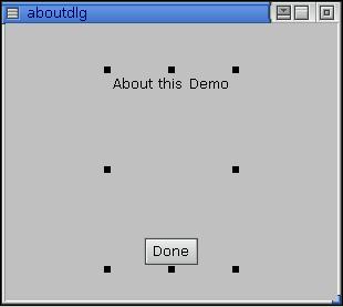
    The two labels and the button should now be centered horizontally within your dialog. Your aboutdlg module should now look like this:

    aboutdlg module

Adding a callback to the Done button

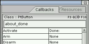
Now let's add a callback to the Done button so that the dialog closes when the user clicks on the button.

  1. Select the Done button, then switch to the Callbacks control panel.
  2. Click on Activate to add an activate callback. You'll see the callback editor.
  3. Select the Done code type, then click on Apply. Don't enter anything in the Function field.

    Selecting the Done code type tells the widget to perform a "Done" operation when the widget is activated. That is, the widget calls the function specified in the Function field (if one is specified) and then closes the dialog module.

  4. Close the editor. The callback list now indicates that you've added an Activate callback called Done:

    Activate callback

Modifying a generated code function

You'll now modify the generated aboutdlg_setup() function so that it changes the text of the about_version label to show a version number.

  1. Save your application.
  2. Open the Build + Run dialog and generate the code.
  3. When code generation is complete, close the Generate Code dialog, select aboutdlg_setup.c from the file list, and click on the Edit button (or double-click on the filename).

    Change the code from:

    int
    aboutdlg_setup( PtWidget_t *link_instance, 
                    ApInfo_t *apinfo, 
                    PtCallbackInfo_t *cbinfo )
    {
    
        /* eliminate 'unreferenced' warnings */
        link_instance = link_instance, 
                        apinfo = apinfo, 
                        cbinfo = cbinfo;
    
        return( Pt_CONTINUE );
    }

    to the following:

    int
    aboutdlg_setup( PtWidget_t *link_instance, 
                    ApInfo_t *apinfo, 
                    PtCallbackInfo_t *cbinfo )
    {
    
        /* eliminate 'unreferenced' warnings */
        link_instance = link_instance, apinfo = apinfo, 
                        cbinfo = cbinfo;
    
        PtSetResource( ABW_about_version, Pt_ARG_TEXT_STRING,
                       "1.00", 0);
    
        return( Pt_CONTINUE );
    
    }

    The code is placing the version number (1.00) into the text string resource for the about_version widget. To do this, the code calls PtSetResource() to set the resource for the about_version widget. The code uses the PhAB-generated manifest ABW_about_version, which provides access to the widget's instance pointer.

    We can use this manifest safely since we're dealing with a dialog module -- PhAB ensures that only one instance of the dialog will exist at any given time.

  4. Save your changes and exit the text editor.

Compiling and Running

You're now ready to compile and run the program:

  1. Click on the Make button. If your program compiles and links without errors (which it should if you edited the function correctly), click on the Run button to start the application.
  2. From the running application, open the Help menu and choose About Demo. The dialog will open, and you'll see the version number (1.00) under the label "About this Demo." Note that the dialog appears in the location you specified.
  3. Now try to bring up a second instance of the dialog. As you see, it won't work. PhAB always ensures that there is only one instance of a Dialog widget.
  4. Click on Done to close the dialog, then quit the application by choosing the Quit item from its File menu. Finally, close the Build + Run dialog.

Want more info?

For more info on: See the section: In the chapter:
Using dialogs Dialog modules Working with Modules
Instance names Instance names Creating Widgets in PhAB
Variables and manifests Working with Code
Callbacks Callbacks Editing Resources and Callbacks in PhAB
Code-callback functions Working with Code
Generating code Generating application code Generating, Compiling, and Running Code

Tutorial 5 -- creating windows

In the previous tutorial, you learned how to handle dialog modules, which support just one instance. In this tutorial you'll learn how to handle window modules, which support multiple instances.


Note: This tutorial uses the application you created in Tutorial 4.

By supporting multiple instances, window modules provide more flexibility than dialogs. But to take advantage of this flexibility, you must keep track of each window's instance pointer. Doing so ensures that you correctly reference the widgets within each instance of a window. You can't safely use the generated global ABW_xxx manifest since it refers only to the last instance created.

To simplify the task of working with multiple instances, PhAB provides API library functions that let you access any widget by means of its global variable name (ABN_xxx).

Creating a window

To start, let's create a window module and attach it to the New menu item in the File menu in tut4. This window will contain buttons that change the color of another widget.

In the previous tutorial, you created a dialog module from within the callback editor. But this time you'll use the module selector to create the module you want. In the future, use whatever method you prefer.

  1. Open the tut4 application if you removed it from the PhAB workspace.
  2. Save the application as tut5.
  3. Iconify the aboutdlg dialog module.
  4. From the Application menu, choose the Windows item to open the module selector.
  5. In the Name field, type newwin for the window's instance name, then press Enter or click on Open. When PhAB prompts you to choose the style for the window, choose Plain and click on Done.
  6. Close the module selector. The window module should now be the currently selected item.

Attaching callbacks

Because a window module supports multiple instances, you have to create code functions that will be called whenever the window opens or closes (i.e. whenever the window is created or destroyed). So let's first set up a callback to detect when the window closes:

  1. Switch to the Callbacks control panel, if necessary.
  2. From the list of callbacks, choose Window Manager. You want to use the Window Manager callback since it's invoked when the Photon Window Manager closes the window.
  3. In the Function field, type newwin_close. You don't have to choose a callback type since the default, Code, is the one you want.

    Click on Apply, then on Done.

  4. Switch to the Resources control panel and select the Flags: Notify resource. Make sure that the Ph_WM_CLOSE flag is set (i.e. highlighted), then click on Done. This flag tells the Window Manager to notify your application when the window is closed.
  5. Now let's set up a function that's invoked when the window opens.

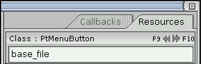
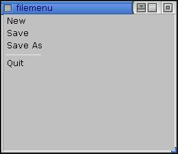
    Open the filemenu menu module, then select the Menu Items resource in the Resources control panel. You'll see the menu editor.

  6. Make sure the menu's New item is currently selected in the Menu Items list, then click on the Callback icon to open the callback editor.
  7. Choose the Window module type, then click on the arrow next to the Name field. You'll see the list of existing window modules.
  8. Choose newwin, which is the window you just created.
  9. In the Setup Function field, enter newwin_setup as the name of the setup function. Later, you'll modify newwin_setup() to handle the window's multiple instances.
  10. Click Apply, then on Done. Click on Done again to close the menu editor.

Adding widgets

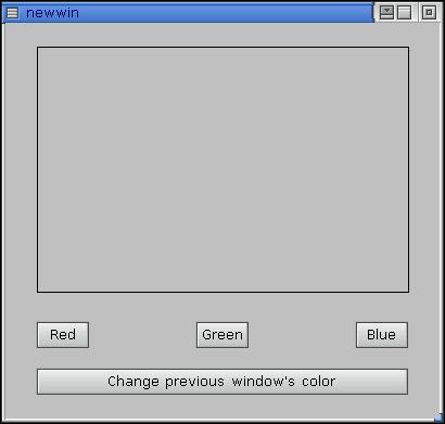
Let's now add some widgets to the newwin window module. Using these widgets, you'll learn how to update information in the current or other instances of a window module.

  1. Add a PtRect widget and four PtButton widgets as follows:

    New window 1

  2. Now modify the left button:
  3. Modify the middle button:
  4. Modify the right button:
  5. Modify the large button:
  6. Last of all, give the rectangle an instance name of color_rect. You need to specify this name so that the color_change() function can change the color of the rectangle.

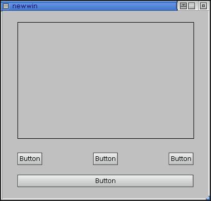
Your window should now look something like this:

New window 2

Generating and modifying the code

In the last tutorial, you used the generated ABW_xxx manifest to access a dialog's instance pointer. You can't use this manifest when dealing with multiple instances of a window module since it refers only to the last window created. Instead, you have to add code to the generated window-setup function so that it stores a copy of each window-instance pointer in a global widget array. In this tutorial, you'll need these pointers for the "Change Previous Window Color" button to work.

Generating the code

Open the Build + Run dialog and regenerate the code.

Modifying the setup function

Now let's modify the newwin_setup() function so that it:

Edit the newwin_setup.c file as follows:

int         win_ctr = 0;
PtWidget_t *win[5];

int
newwin_setup( PtWidget_t *link_instance, 
              ApInfo_t *apinfo, 
              PtCallbackInfo_t *cbinfo )
{
    char    buffer[40];

    /* eliminate 'unreferenced' warnings */
    link_instance = link_instance, apinfo = apinfo;
    cbinfo = cbinfo;

    /* Note: Returning Pt_END in a prerealize setup
       function tells PhAB to destroy the module
       without realizing it */

    /* allow only 5 windows max */
    if ( win_ctr == 5 ) {
        return( Pt_END );
    }

    /* save window-module instance pointer */
    win[win_ctr] = link_instance;

    sprintf( buffer, "Window %d", win_ctr + 1 );
    PtSetResource( win[win_ctr], Pt_ARG_WINDOW_TITLE, 
                   buffer, 0 );
    win_ctr++;

    return( Pt_CONTINUE );

}

Modifying the color-change function

Now let's modify the color_change() function so that:


Note: If this were a dialog module you could use the ABW_color_rect manifest to update the color of the rectangle. However, because these are window modules, you must use the instance pointer for the window in which the button is being pressed.

To get the instance pointer of a widget in the current window, you need to call:

If only one instance of the window were guaranteed, the following would work:

PtSetResource( ABW_color_rect, Pt_ARG_FILL_COLOR, 
               buffer, 0 );

But in this case color_change() has to use:

PtSetResource( ApGetWidgetPtr( ApGetInstance( widget ), 
               ABN_color_rect ), Pt_ARG_FILL_COLOR, 
               buffer, 0 );

So you need to change color_change.c to look like:

PgColor_t          colors[5] = {Pg_BLACK, Pg_YELLOW,
                                Pg_MAGENTA, Pg_CYAN,
                                Pg_DGREEN};
int                base_clr = -1;
extern int         win_ctr;
extern PtWidget_t *win[5];

int
color_change( PtWidget_t *widget, ApInfo_t *apinfo, 
              PtCallbackInfo_t *cbinfo )
{
  int     i, prev;
  PtWidget_t *this_window;

  /* eliminate 'unreferenced' warnings */
  widget = widget, apinfo = apinfo, cbinfo = cbinfo;

  /* Get a pointer to the current window. */
  this_window = ApGetInstance( widget );

  if ( ApName( widget ) == ABN_btn_red ) {
       PtSetResource( 
          ApGetWidgetPtr( this_window, ABN_color_rect ), 
          Pt_ARG_FILL_COLOR, Pg_RED, 0 );

  } else if ( ApName( widget ) == ABN_btn_green ) {
       PtSetResource( 
          ApGetWidgetPtr( this_window, ABN_color_rect ), 
          Pt_ARG_FILL_COLOR, Pg_GREEN, 0 );

  } else if ( ApName( widget ) == ABN_btn_blue ) {
       PtSetResource(
          ApGetWidgetPtr( this_window, ABN_color_rect ), 
          Pt_ARG_FILL_COLOR, Pg_BLUE, 0 );

  } else if ( ApName( widget ) == ABN_btn_prev ) {

       /* Note: Here we use the window-module instance 
                pointers saved in newwin_setup to update 
                the window previous to the current window
                provided it hasn't been closed.

          Determine which window is previous to this window. */

       prev = -1;
       for ( i = 0; i < win_ctr; i++ ) {
           if ( win[i] == this_window ) {
               prev = i - 1;
               break;
           }
       }

       /* If the window still exists, update its background
          color. */

       if ( prev != -1 && win[prev] ) {
           base_clr++;
           if (base_clr >= 5) {
               base_clr = 0;
           }
           PtSetResource( win[prev], Pt_ARG_FILL_COLOR, 
                          colors[base_clr], 0 ); 
       }
   }

   return( Pt_CONTINUE );
}

Modifying the window-close function

Last of all, you need to modify newwin_close() so that it sets the win array of instance pointers to NULL for a window when it's closed. That way, you can check for NULL in the win array to determine whether the window still exists.

Modify newwin_close.c as follows:

extern int         win_ctr;
extern PtWidget_t *win[5];

int
newwin_close( PtWidget_t *widget, ApInfo_t *apinfo, 
              PtCallbackInfo_t *cbinfo )
{
    PhWindowEvent_t *we = cbinfo->cbdata;
    int              i;

    /* eliminate 'unreferenced' warnings */
    apinfo = apinfo;

    /* only process WM close events */
    if ( we->event_f != Ph_WM_CLOSE ) {
        return( Pt_CONTINUE );
    }

    /* okay it's a close so who is it? */
    for ( i = 0; i < win_ctr; i++ ) {
        if ( win[i] == widget ) {
            win[i] = NULL;
            break;
        }
    }

    return( Pt_CONTINUE );
}

Compiling and running

  1. Make the application and run it.
  2. From the application's File menu, choose New several times to create multiple windows. You'll see each window's relative number in its titlebar.
  3. Click on a color button to make the rectangle change color. Then click on the Change Previous Window Color button in any window to change the background color of the previous window.

Want more info?

For more info on: See the section: In the chapter:
Using windows Window modules Working with Modules
Instance names Instance names Creating Widgets in PhAB
Variables and manifests Working with Code chapter
Callbacks Callbacks Editing Resources and Callbacks in PhAB
Code-callback functions Working with Code
Generating code Generating application code Generating, Compiling, and Running Code
Window events Window-management flags Window Management

[Previous] [Contents] [Index] [Next]